Summary
- Color significantly influences how consumers feel, perceive, and engage with marketing messages.
Strategic color choices can boost brand recall, enhance emotional impact, and increase conversions. - TV and digital ads use warm and cool tones to set mood, trigger action, and reinforce brand identity.
- Cultural and psychological factors shape how color is interpreted, requiring context-aware design choices.
- Consistency, accessibility, and testing are essential for effective color usage across campaigns.
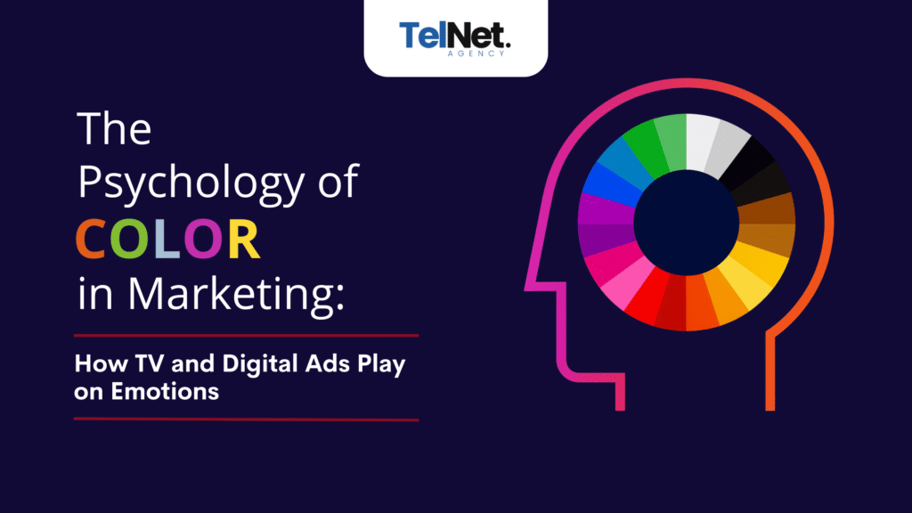
Marketing depends on visuals to shape perception, but color takes it a step further by evoking emotion and guiding decisions. It not only sets the tone but also builds brand identity and can directly impact buying behavior. From polished TV commercials to fast-moving social ads, color plays a crucial role in how audiences interpret and react to a message.
This psychological impact makes color an essential element in advertising strategy. When used deliberately, color not only strengthens brand recognition but also enhances performance metrics across platforms.
This article explores how color psychology functions in marketing and the specific ways it shapes consumer response in both television and digital advertising.
Decoding Color Psychology
Color psychology explores how hues impact human reactions. Studies show that between 62 and 90 percent of consumer assessment of products or individuals is based solely on color, often within the first 90 seconds of exposure. Therefore, careful selection of brand colors can significantly affect mood, perception, and intent.
Research from California State University highlights how color psychology directly supports branding strategy and enhances both brand identity and recognition when used purposefully in marketing visuals.
Emotional Associations with Common Colors:
- Red: Often linked to energy, urgency, and passion
- Blue: Suggests trust, calmness, and stability
- Yellow: Conveys happiness, optimism, and friendliness
- Green: Associated with nature, health, and balance
- Black: Represents sophistication, power, and exclusivity
- Purple: Evokes creativity, luxury, and wisdom
- Orange: Implies vitality, enthusiasm, and motivation
- Pink: Symbolizes love, compassion, and femininity
Understanding these associations enables marketers to create visual narratives that resonate with targeted audiences across various platforms.
How Colors Are Used in TV and Digital Ads
The use of color in advertising goes beyond aesthetic appeal. It plays a direct role in shaping the viewer’s emotional experience and guiding interaction. Television ads benefit from broad emotional storytelling, while digital ads rely on immediate engagement, making strategic color application crucial in both spaces.
1. Setting the Tone and Mood
Color sets the emotional tone of a campaign within seconds. Warm and cool tones are used strategically across industries to evoke specific feelings, influence behavior, and support brand positioning.
Warm Colors: High Energy, Excitement, and Urgency
Red, orange, and yellow are commonly used in fast-paced or high-impact campaigns. These colors create a sense of enthusiasm, appetite, and action.
Examples of brands using warm tones:
McDonald’s
- Uses a combination of red and yellow to trigger appetite and energy. These colors appear across its TV ads, signage, mobile app, and digital banners.
Coca-Cola
- Relies on bold red to convey passion, excitement, and friendliness—reinforcing its sociable, upbeat
Cool Colors: Calm, Trust, and Professionalism
Blue, green, and purple are associated with stability, credibility, and peace. These are frequently used in finance, healthcare, wellness, and tech.
Examples of brands using cool tones:
American Express
- Use blue to build trust and authority in the financial space. Blue dominates their websites, ads, and app UIs.
CVS Health
- Incorporates soft blues and greens in its marketing to reflect care, health, and calmness.
2. Establishing Brand Identity
A consistent color palette reinforces recognition and credibility. Brands like Coca-Cola (red) and T-Mobile (magenta) maintain visual continuity across campaigns, improving brand recall and consumer trust.
Research from Loyola University Maryland indicates that color can increase brand recognition by up to 80 percent, particularly when comparing color branding to monochromatic alternatives. This demonstrates how maintaining a distinctive, recognizable color scheme can give brands a clear edge in crowded markets.
In digital spaces, where attention spans are short and competition is high, consistent brand colors in thumbnails, banner ads, and CTAs help capture recognition faster than logos or taglines.
3. Guiding Emotion and Action
Color doesn’t just shape perception, it influences behavior. Marketers often use specific color cues to guide consumers toward a desired action. For example, red is frequently used on “Buy Now” or “Limited Offer” buttons because it creates urgency and stimulates quick decision-making. Conversely, green is associated with safety and success, making it a common choice for “Submit” or “Continue” buttons on checkout pages and lead forms.
In video ads, emotional cues are amplified through background colors, lighting, and wardrobe styling. A call-to-action at the end of a TV commercial might be framed with bright reds or oranges to prompt immediate action, while a tutorial-style YouTube ad might rely on soft blues and whites to keep the viewer focused and relaxed.
4. Enhancing Brand Recall
For advertising to be effective, it must be memorable, and color plays a direct role in memory encoding. Psychologically, the human brain processes visual elements faster than text, and color increases the speed and accuracy of this process. When consumers are repeatedly exposed to the same color schemes in different contexts such as TV commercials, digital banners, product packaging, and social media, they develop a cognitive link between the color and the brand.
This link is what builds recall. A consumer who remembers “the brand with the purple packaging” or “the one with the clean, blue app interface” is more likely to engage again and develop loyalty over time. Neuromarketing studies show that repeated exposure to specific brand colors activates recognition pathways in the brain, even when the logo or product is not fully visible.
5. Cultural Considerations
Color meanings are not universal. Cultural norms, traditions, and associations deeply influence how audiences interpret color in advertisements. For example, while white often symbolizes purity and new beginnings in Western cultures, it can signify mourning in some East Asian cultures. Similarly, red is considered lucky and celebratory in China, but it may convey danger or aggression in other regions.
As brands expand into international markets, these cultural differences in color perception must be considered. A color that drives engagement in one country could lead to misunderstanding or offense in another. Multinational brands often adapt their color usage for local campaigns, selecting hues that align with regional expectations while still maintaining global brand integrity.
Best Practices for Using Color Psychology in Advertising
The success of color in advertising lies not only in selection but also in thoughtful application. Marketers must ensure that color choices align with brand values, audience expectations, and functional goals.
Recommended practices include:
- Use colors that reflect the brand’s personality and positioning
- Analyze target audience demographics, including culture, age, and gender
- Apply contrasting color schemes to emphasize hierarchy and guide focus
- Maintain consistent use of color across all media channels
- Optimize visual assets for accessibility to color-deficient viewers
- Conduct A/B tests to measure the impact of different color variations
These practices help marketers balance creativity with usability, creating visually effective campaigns that connect on a deeper level.
CTA: Need help crafting cross-platform campaigns with color psychology in mind? Get in touch!
Final Verdict
Color in marketing is not merely decorative; it is strategic. Scientific studies and industry practice confirm that color shapes perception, emotion, and decision behavior. When combined with consistent branding, emotional resonance, and accessibility, it becomes a driver of marketing success.
For advertisers seeking agile impact across TV and digital platforms, color psychology should be intentional and measurable. Aligning hue with message can transform visual storytelling into emotional connection, and fleeting impressions into loyal engagement.